


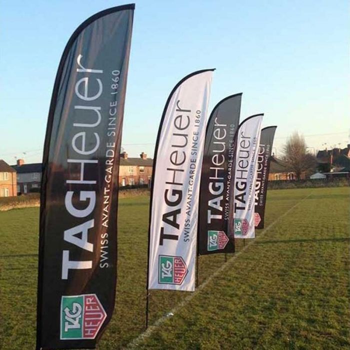
A feather flag is one of the most effective pieces of outdoor marketing available to a business. Tall, dynamic, and impossible to ignore when done well, it delivers a message before the viewer has consciously decided to look. A poorly designed one gets glanced at, filed as background noise, and forgotten within seconds.
The difference between the two is almost never the quality of the print or the hardware. It is the design. Here is what separates a feather flag that works from one that does not.
Font Size: Bigger Than You Think
The single most common mistake in feather flag design is using text that is too small. On a screen, the design looks perfectly legible. On a 4-metre flag viewed from a moving car or a busy pavement, it disappears entirely.
As a rule of thumb, any text you want people to read from ten metres away needs to be far larger than feels comfortable on a monitor. A good test is to view your design at thumbnail size: if you can still read it clearly, the font size is probably about right.
Stick to one or two lines of text at most. A headline and a supporting detail such as a web address is usually the limit of what a feather flag can carry legibly. Anything more and the text starts to compete with itself.
Colour Contrast: Make It Impossible to Miss
Colour is doing the heavy lifting long before anyone has read a single word on your flag. High contrast between the background and the text or logo is not a stylistic choice; it is a functional requirement. Dark text on a light background, or light text on a dark background, read clearly at distance. Mid-tone combinations, however attractive they might appear in a brand context, tend to blur into each other as viewing distance increases.
If your brand colours are naturally low contrast, consider using a stronger version of one of them for the flag background, or introducing a contrasting outline around text and logos. A white stroke around dark text on a coloured background is one of the oldest tricks in outdoor advertising, and it works.
Avoid gradients on the text itself. Solid colours hold their clarity at distance far better than anything that fades or transitions, and the curved, moving surface of a feather flag is not a forgiving environment for subtle design details.
Logo Placement: High and Central
On a custom feather flag, the upper two-thirds of the flag body is prime real estate. This is the area that sits at eye level and above when the flag is installed, and it is the area that moves most visibly in the wind. Your logo or primary message should sit here, not at the bottom of the flag where it may be partially obscured by the ground spike or base, and where the eye is least likely to travel.
Keep the logo to a size that gives it breathing room. A logo crammed into a corner or squeezed between competing elements looks amateur and reads poorly. White space is not wasted space on a feather flag; it is what gives the logo the visual authority it needs to be noticed.
If you are including both a logo and text, the logo should almost always come first, with the supporting text beneath it. People recognise a logo faster than they read words, and on a flag that someone is passing at speed, the logo is often the only element they will register.
Readability at Speed: Design for the Moving Viewer
Most people who see your feather flag will be moving. Your design needs to communicate its core message in under two seconds, because that is often all the time you have.
Ask yourself: what is the one thing this flag is trying to say? If that is not immediately obvious from a quick glance, simplify until it is. A flag that tries to say three things ends up saying nothing.
Bold, simple shapes work better than detailed illustrations at distance. A strong wordmark or a clean icon will outperform a complex logo in almost every case. If your full logo includes fine detail or intricate linework, a simplified version will serve the flag better.
Avoiding Clutter: Less Is Almost Always More
A feather flag is not a brochure. It is not a website. It is a single moment of visual communication, and every element you add to the design competes for the viewer's attention and dilutes the impact of everything else.
Resist the urge to include your address, social handles, tagline, phone number, website, and logo all on the same flag. Choose the one or two things that matter most and give them room to breathe.
The best feather flags are often the simplest ones. A strong brand colour, a clean logo, and a single line of text is frequently all that is needed to create something genuinely eye-catching. Custom printed feather flags are available in a range of sizes from 2.3 metres up to 5.15 metres, so there is a format to suit every setting, from a retail forecourt to a trade show to an outdoor event. Whichever size you choose, the design principles are the same: bold, clear, and uncluttered.
Ready to get started? Design your own custom feather flag at customflags.co.uk!